CSS Progress Circle [fechado]


112

Pesquisei neste site para encontrar barras de progresso, mas as que consegui encontrar mostram círculos animados que chegam a 100%.

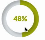
Eu gostaria que parasse em certas percentagens, como na imagem abaixo. Existe alguma maneira de fazer isso usando apenas CSS?

Barras de progresso circulares


Não estou procurando um script, estou procurando qualquer informação CSS3 sobre isso.
Adam GunShy disse em

8
Esqueça as palavras, a pergunta "Como fazer um círculo de progresso Css?" ainda é válido. Acho que deveria ser reaberto com nova redação, esse resultado é primeiro nas buscas e contém respostas desatualizadas.
Ciantic de

de qual site é essa captura de tela?
MoralCode

10
Este é o resultado número um no google para 'css de indicador de progresso circular'. Uma pena que a questão esteja encerrada.
Gopherkhan de

Se você estiver usando o LESS, talvez esteja interessado em cssscript.com/pure-css-circular-percentage-bar
jchook

Respostas:


119

Criei um tutorial sobre como fazer exatamente isso com CSS3 e a biblioteca LESS JavaScript. Você pode encontrar a postagem do blog aqui: https://medium.com/secoya-tech/a917b80c43f9

Aqui está um jsFiddle do resultado final. A porcentagem é definida por meio do data-progressatributo. As mudanças são animadas usando transições CSS.

gif do indicador de progresso radial


3
Não tinha ideia de que você poderia fazer isso com css. Agradável.
Hobbes de

4
Porém, grande impacto no desempenho ... tornando-o inutilizável para meu aplicativo = [
Hobbes

2
Excelente material. Um problema menor no Firefox (usando a edição 41.0a2 do desenvolvedor) cria bordas nítidas visíveis durante a transformação. Fácil de ver se você definir o progresso para 90 e o tempo de transição para 10s. Para corrigir, basta adicionar outline: 1px solid transparent;ao .mask, .fill, .shadowgrupo.
luopio

5
@Hobbes, você não pode, o pôster está mentindo. Esta resposta usa grandes quantidades de Javascript por meio de uma biblioteca chamada LESS.
GetFree

6
Eu criei uma versão do Sass, apenas no caso de alguém querer tentar: gist.github.com/digitalbreed/84a19db69244b22519e03550ba010a25
digitalbreed

78

Criei um violino usando apenas CSS .

.wrapper {
  width: 100px; /* Set the size of the progress bar */
  height: 100px;
  position: absolute; /* Enable clipping */
  clip: rect(0px, 100px, 100px, 50px); /* Hide half of the progress bar */
}
/* Set the sizes of the elements that make up the progress bar */
.circle {
  width: 80px;
  height: 80px;
  border: 10px solid green;
  border-radius: 50px;
  position: absolute;
  clip: rect(0px, 50px, 100px, 0px);
}
/* Using the data attributes for the animation selectors. */
/* Base settings for all animated elements */
div[data-anim~=base] {
  -webkit-animation-iteration-count: 1;  /* Only run once */
  -webkit-animation-fill-mode: forwards; /* Hold the last keyframe */
  -webkit-animation-timing-function:linear; /* Linear animation */
}

.wrapper[data-anim~=wrapper] {
  -webkit-animation-duration: 0.01s; /* Complete keyframes asap */
  -webkit-animation-delay: 3s; /* Wait half of the animation */
  -webkit-animation-name: close-wrapper; /* Keyframes name */
}

.circle[data-anim~=left] {
  -webkit-animation-duration: 6s; /* Full animation time */
  -webkit-animation-name: left-spin;
}

.circle[data-anim~=right] {
  -webkit-animation-duration: 3s; /* Half animation time */
  -webkit-animation-name: right-spin;
}
/* Rotate the right side of the progress bar from 0 to 180 degrees */
@-webkit-keyframes right-spin {
  from {
    -webkit-transform: rotate(0deg);
  }
  to {
    -webkit-transform: rotate(180deg);
  }
}
/* Rotate the left side of the progress bar from 0 to 360 degrees */
@-webkit-keyframes left-spin {
  from {
    -webkit-transform: rotate(0deg);
  }
  to {
    -webkit-transform: rotate(360deg);
  }
}
/* Set the wrapper clip to auto, effectively removing the clip */
@-webkit-keyframes close-wrapper {
  to {
    clip: rect(auto, auto, auto, auto);
  }
}
<div class="wrapper" data-anim="base wrapper">
  <div class="circle" data-anim="base left"></div>
  <div class="circle" data-anim="base right"></div>
</div>

Verifique também este violino aqui (somente CSS)

@import url(http://fonts.googleapis.com/css?family=Josefin+Sans:100,300,400);
    
.arc1 {
    width: 160px;
    height: 160px;
    background: #00a0db;
    -webkit-transform-origin: -31% 61%;
    margin-left: -30px;
    margin-top: 20px;
    -webkit-transform: translate(-54px,50px);
    -moz-transform: translate(-54px,50px);
    -o-transform: translate(-54px,50px);
}
.arc2 {
    width: 160px;
    height: 160px;
    background: #00a0db;
    -webkit-transform: skew(45deg,0deg);
    -moz-transform: skew(45deg,0deg);
    -o-transform: skew(45deg,0deg);
    margin-left: -180px;
    margin-top: -90px;
    position: absolute;
    -webkit-transition: all .5s linear;
    -moz-transition: all .5s linear;
    -o-transition: all .5s linear;
}

.arc-container:hover .arc2 {
    margin-left: -50px;
    -webkit-transform: skew(-20deg,0deg);
    -moz-transform: skew(-20deg,0deg);
    -o-transform: skew(-20deg,0deg);
}

.arc-wrapper {
    width: 150px;
    height: 150px;
    border-radius:150px;
    background: #424242;
    overflow:hidden;
    left: 50px;
    top: 50px;
    position: absolute;
}
.arc-hider {
    width: 150px;
    height: 150px;
    border-radius: 150px;
    border: 50px solid #e9e9e9;
    position:absolute;
    z-index:5;
    box-shadow:inset 0px 0px 20px rgba(0,0,0,0.7);
}

.arc-inset  {
    font-family: "Josefin Sans";
    font-weight: 100;
    position: absolute;
    font-size: 413px;
    margin-top: -64px;
    z-index: 5;
    left: 30px;
    line-height: 327px;
    height: 280px;
    -webkit-mask-image: -webkit-linear-gradient(top, rgba(0,0,0,1), rgba(0,0,0,0.2));
}
.arc-lowerInset {
    font-family: "Josefin Sans";
    font-weight: 100;
    position: absolute;
    font-size: 413px;
    margin-top: -64px;
    z-index: 5;
    left: 30px;
    line-height: 327px;
    height: 280px;
    color: white;
    -webkit-mask-image: -webkit-linear-gradient(top, rgba(0,0,0,0.2), rgba(0,0,0,1));
}
.arc-overlay {
    width: 100px;
    height: 100px;
    background-image: linear-gradient(bottom, rgb(217,217,217) 10%, rgb(245,245,245) 90%, rgb(253,253,253) 100%);
    background-image: -o-linear-gradient(bottom, rgb(217,217,217) 10%, rgb(245,245,245) 90%, rgb(253,253,253) 100%);
    background-image: -moz-linear-gradient(bottom, rgb(217,217,217) 10%, rgb(245,245,245) 90%, rgb(253,253,253) 100%);
    background-image: -webkit-linear-gradient(bottom, rgb(217,217,217) 10%, rgb(245,245,245) 90%, rgb(253,253,253) 100%);

    padding-left: 32px;
    box-sizing: border-box;
    -moz-box-sizing: border-box;
    line-height: 100px;
    font-family: sans-serif;
    font-weight: 400;
    text-shadow: 0 1px 0 #fff;
    font-size: 22px;
    border-radius: 100px;
    position: absolute;
    z-index: 5;
    top: 75px;
    left: 75px;
    box-shadow:0px 0px 20px rgba(0,0,0,0.7);
}
.arc-container {
    position: relative;
    background: #e9e9e9;
    height: 250px;
    width: 250px;
}
<div class="arc-container">
    <div class="arc-hider"></div>
    <div class="arc-inset">
        o
    </div>
    <div class="arc-lowerInset">
        o
    </div>
    <div class="arc-overlay">
        35%
    </div>
    <div class="arc-wrapper">
        <div class="arc2"></div>
        <div class="arc1"></div>
    </div>
</div>

Ou esta bela barra de progresso redonda com HTML5, CSS3 e JavaScript.


@panos eu tentei sua primeira solução. Preciso que a borda do .circle tenha 6px em vez de 10px. Consegui o mesmo, mas ao chegar a 50%. Ele dá um puxão e novamente inicia a animação. Experimente
Santhosh Kumar

@ Santosh-kumar, você precisa alterar outros valores também
Panos Kal.

@panos Como eu mudaria o primeiro progresso das soluções? isso poderia ser feito com um elemento de dados? Eu sou bastante novo em animação
anthonytherockjohnson

1
De acordo com o MDN, clip agora está obsoleto.
jstaab

36

Que tal?

HTML

<div class="chart" id="graph" data-percent="88"></div>

Javascript

var el = document.getElementById('graph'); // get canvas

var options = {
    percent:  el.getAttribute('data-percent') || 25,
    size: el.getAttribute('data-size') || 220,
    lineWidth: el.getAttribute('data-line') || 15,
    rotate: el.getAttribute('data-rotate') || 0
}

var canvas = document.createElement('canvas');
var span = document.createElement('span');
span.textContent = options.percent + '%';

if (typeof(G_vmlCanvasManager) !== 'undefined') {
    G_vmlCanvasManager.initElement(canvas);
}

var ctx = canvas.getContext('2d');
canvas.width = canvas.height = options.size;

el.appendChild(span);
el.appendChild(canvas);

ctx.translate(options.size / 2, options.size / 2); // change center
ctx.rotate((-1 / 2 + options.rotate / 180) * Math.PI); // rotate -90 deg

//imd = ctx.getImageData(0, 0, 240, 240);
var radius = (options.size - options.lineWidth) / 2;

var drawCircle = function(color, lineWidth, percent) {
        percent = Math.min(Math.max(0, percent || 1), 1);
        ctx.beginPath();
        ctx.arc(0, 0, radius, 0, Math.PI * 2 * percent, false);
        ctx.strokeStyle = color;
        ctx.lineCap = 'round'; // butt, round or square
        ctx.lineWidth = lineWidth
        ctx.stroke();
};

drawCircle('#efefef', options.lineWidth, 100 / 100);
drawCircle('#555555', options.lineWidth, options.percent / 100);

e CSS

div {
    position:relative;
    margin:80px;
    width:220px; height:220px;
}
canvas {
    display: block;
    position:absolute;
    top:0;
    left:0;
}
span {
    color:#555;
    display:block;
    line-height:220px;
    text-align:center;
    width:220px;
    font-family:sans-serif;
    font-size:40px;
    font-weight:100;
    margin-left:5px;
}

http://jsfiddle.net/Aapn8/3410/

O código básico foi retirado do Simple PIE Chart http://rendro.github.io/easy-pie-chart/


Esta foi a melhor solução para mim (não jquery também!).
Andy B

2
Para mim também. Aqui está como animá-lo: drawCircle ('# efefef', options.lineWidth, 100/100); var i = 0; var int = setInterval (function () {i ++; drawCircle ('# 555555', options.lineWidth, i / 100); span.textContent = i + "%"; if (i> = 100) {clearInterval (int);} }, 100);
março

1
Como definir cores de gradiente para o círculo?
yaniv14,

jsFiddle não mostra uma barra no Chrome.
Esamo

10

Outra solução baseada em CSS puro que é baseada em dois elementos arredondados recortados que eu giro para chegar ao ângulo certo:

http://jsfiddle.net/maayan/byT76/

Esse é o css básico que o habilita:

.clip1 {
    position:absolute;
    top:0;left:0;
    width:200px;
    height:200px;
    clip:rect(0px,200px,200px,100px);
}
.slice1 {
    position:absolute;
    width:200px;
    height:200px;
    clip:rect(0px,100px,200px,0px);
    -moz-border-radius:100px;
    -webkit-border-radius:100px; 
    border-radius:100px;
    background-color:#f7e5e1;
    border-color:#f7e5e1;
    -moz-transform:rotate(0);
    -webkit-transform:rotate(0);
    -o-transform:rotate(0);
    transform:rotate(0);
}

.clip2 
{
    position:absolute;
    top:0;left:0;
    width:200px;
    height:200px;
    clip:rect(0,100px,200px,0px);
}

.slice2
{
    position:absolute;
    width:200px;
    height:200px;
    clip:rect(0px,200px,200px,100px);
    -moz-border-radius:100px;
    -webkit-border-radius:100px; 
    border-radius:100px;
    background-color:#f7e5e1;
    border-color:#f7e5e1;
    -moz-transform:rotate(0);
    -webkit-transform:rotate(0);
    -o-transform:rotate(0);
    transform:rotate(0);
}

e o js gira conforme necessário.

muito fácil de entender ..

Espero que ajude Maayan


1
Dentro do jQuery, não há necessidade de definir todo o -vendor-prefixesinterior .css()♪ Use apenastransform: 'rotate(' + degree + 'deg)'
Roko C. Buljan

1
Este é o mais fácil e limpo, trabalhei a partir do exemplo de @Maayan e consegui isso: jsfiddle.net/g8z64Ler
lukart
Ao utilizar nosso site, você reconhece que leu e compreendeu nossa Política de Cookies e nossa Política de Privacidade.
Licensed under cc by-sa 3.0 with attribution required.