EDIT: A nova Biblioteca de Suporte de Design suporta isso e o método anterior não é mais necessário.
Agora isso pode ser conseguido usando a nova Biblioteca de Suporte de Design Android .
Você pode ver o aplicativo de exemplo Cheesesquare de Chris Banes, que demonstra todos os novos recursos.
Método anterior:
Como não há uma solução completa postada, eis o modo como atingi o resultado desejado.
Primeiro, inclua um ScrimInsetsFrameLayout no seu projeto.
/*
* Copyright 2014 Google Inc.
*
* Licensed under the Apache License, Version 2.0 (the "License");
* you may not use this file except in compliance with the License.
* You may obtain a copy of the License at
*
*     http://www.apache.org/licenses/LICENSE-2.0
*
* Unless required by applicable law or agreed to in writing, software
* distributed under the License is distributed on an "AS IS" BASIS,
* WITHOUT WARRANTIES OR CONDITIONS OF ANY KIND, either express or implied.
* See the License for the specific language governing permissions and
* limitations under the License.
*/

/**
* A layout that draws something in the insets passed to
* {@link #fitSystemWindows(Rect)}, i.e. the area above UI chrome
* (status and navigation bars, overlay action bars).
*/
public class ScrimInsetsFrameLayout extends FrameLayout {
    private Drawable mInsetForeground;

    private Rect mInsets;
    private Rect mTempRect = new Rect();
    private OnInsetsCallback mOnInsetsCallback;

    public ScrimInsetsFrameLayout(Context context) {
        super(context);
        init(context, null, 0);
    }

    public ScrimInsetsFrameLayout(Context context, AttributeSet attrs) {
        super(context, attrs);
        init(context, attrs, 0);
    }

    public ScrimInsetsFrameLayout(
        Context context, AttributeSet attrs, int defStyle) {
        super(context, attrs, defStyle);
        init(context, attrs, defStyle);
    }

    private void init(Context context, AttributeSet attrs, int defStyle) {
        final TypedArray a = context.obtainStyledAttributes(attrs,
                R.styleable.ScrimInsetsView, defStyle, 0);
        if (a == null) {
            return;
        }
        mInsetForeground = a.getDrawable(
            R.styleable.ScrimInsetsView_insetForeground);
        a.recycle();

        setWillNotDraw(true);
    }

    @Override
    protected boolean fitSystemWindows(Rect insets) {
        mInsets = new Rect(insets);
        setWillNotDraw(mInsetForeground == null);
        ViewCompat.postInvalidateOnAnimation(this);
        if (mOnInsetsCallback != null) {
            mOnInsetsCallback.onInsetsChanged(insets);
        }
        return true; // consume insets
    }

    @Override
    public void draw(Canvas canvas) {
        super.draw(canvas);

        int width = getWidth();
        int height = getHeight();
        if (mInsets != null && mInsetForeground != null) {
            int sc = canvas.save();
            canvas.translate(getScrollX(), getScrollY());

            // Top
            mTempRect.set(0, 0, width, mInsets.top);
            mInsetForeground.setBounds(mTempRect);
            mInsetForeground.draw(canvas);

            // Bottom
            mTempRect.set(0, height - mInsets.bottom, width, height);
            mInsetForeground.setBounds(mTempRect);
            mInsetForeground.draw(canvas);

            // Left
            mTempRect.set(
                0,
                mInsets.top,
                mInsets.left,
                height - mInsets.bottom);
            mInsetForeground.setBounds(mTempRect);
            mInsetForeground.draw(canvas);

            // Right
            mTempRect.set(
                width - mInsets.right,
                mInsets.top, width,
                height - mInsets.bottom);
            mInsetForeground.setBounds(mTempRect);
            mInsetForeground.draw(canvas);

            canvas.restoreToCount(sc);
        }
    }

    @Override
    protected void onAttachedToWindow() {
        super.onAttachedToWindow();
        if (mInsetForeground != null) {
            mInsetForeground.setCallback(this);
        }
    }

    @Override
    protected void onDetachedFromWindow() {
        super.onDetachedFromWindow();
        if (mInsetForeground != null) {
            mInsetForeground.setCallback(null);
        }
    }

    /**
     * Allows the calling container to specify a callback for custom
     * processing when insets change (i.e. when {@link #fitSystemWindows(Rect)}
     * is called. This is useful for setting padding on UI elements
     * based on UI chrome insets (e.g. a Google Map or a ListView).
     * When using with ListView or GridView, remember to set
     * clipToPadding to false.
     */
    public void setOnInsetsCallback(OnInsetsCallback onInsetsCallback) {
        mOnInsetsCallback = onInsetsCallback;
    }

    public static interface OnInsetsCallback {
        public void onInsetsChanged(Rect insets);
    }
}
Em seguida, crie um estilo para que insetForegroundpossa ser definido.
values / attrs.xml
<declare-styleable name="ScrimInsetsView">
    <attr name="insetForeground" format="reference|color" />
</declare-styleable>
Atualize o arquivo xml da sua atividade e verifique se android:fitsSystemWindowsestá definido como true tanto no DrawerLayoutquanto no ScrimInsetsFrameLayout.
layout / activity_main.xml
<android.support.v4.widget.DrawerLayout
    xmlns:android="http://schemas.android.com/apk/res/android"
    xmlns:tools="http://schemas.android.com/tools"
    android:id="@+id/drawerLayout"
    android:layout_width="match_parent"
    android:layout_height="match_parent"
    android:fitsSystemWindows="true"
    tools:context=".MainActivity">

    <!-- The main content view -->
    <LinearLayout
        android:layout_width="match_parent"
        android:layout_height="match_parent"
        android:orientation="vertical">

        <!-- Your main content -->

    </LinearLayout>

    <!-- The navigation drawer -->
    <com.example.app.util.ScrimInsetsFrameLayout
        xmlns:app="http://schemas.android.com/apk/res-auto"
        android:id="@+id/scrimInsetsFrameLayout"
        android:layout_width="320dp"
        android:layout_height="match_parent"
        android:layout_gravity="start"
        android:background="@color/white"
        android:elevation="10dp"
        android:fitsSystemWindows="true"
        app:insetForeground="#4000">

        <!-- Your drawer content -->

    </com.example.app.util.ScrimInsetsFrameLayout>

</android.support.v4.widget.DrawerLayout>
Dentro do método onCreate da sua atividade, defina a cor de fundo da barra de status no layout da gaveta.
MainActivity.java
@Override
protected void onCreate(Bundle savedInstanceState) {
    super.onCreate(savedInstanceState);
    setContentView(R.layout.activity_main);

    // ...

    mDrawerLayout = (DrawerLayout) findViewById(R.id.drawerLayout);
    mDrawerLayout.setStatusBarBackgroundColor(
        getResources().getColor(R.color.primary_dark));
}
Por fim, atualize o tema do seu aplicativo para que DrawerLayoutfique atrás da barra de status.
values-v21 / styles.xml
<style name="AppTheme" parent="Theme.AppCompat.Light.NoActionBar">
    <item name="android:windowDrawsSystemBarBackgrounds">true</item>
    <item name="android:statusBarColor">@android:color/transparent</item>
</style>
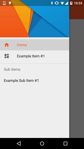
Resultado: